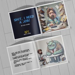
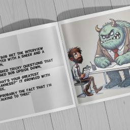
Welcome back to Week 3 of our series on publishing an illustrated Not For Kids book! By now, you should have your story crafted and your illustrations ready to go. This week, we’ll dive into a crucial step: designing the book and perfecting the layouts.
Your book’s design is more than just arranging pictures and text. It’s about creating a cohesive, visually appealing experience that enhances your story. With the right tools and techniques, you can turn your manuscript and illustrations into a professional-quality book.
We’ll break the process down into 6 manageable steps starting with choosing your layout format to testing your layout and getting feedback. I’ll also throw in some AI tools for the layout I stumbled across to hopefully help out. Let’s start!
First, you need to decide on the size and format of your book. For adult-themed children’s books, a square layout (like 8.25” x 8.25”) is a popular choice, as it works well for illustrations and maintains a playful tone. When you use AI for your illustrations, you can add the final size of your book. This will help with the creation of the images to be square or horizontal or vertical—all depending on the size of your book. For Sh*t, I Need a Job, I decided to use an 8.5” x 8.5” since the cost from 8.25” x 8.25” to that size was no big difference—go BIG or go home, right?
Questions to Consider:
-
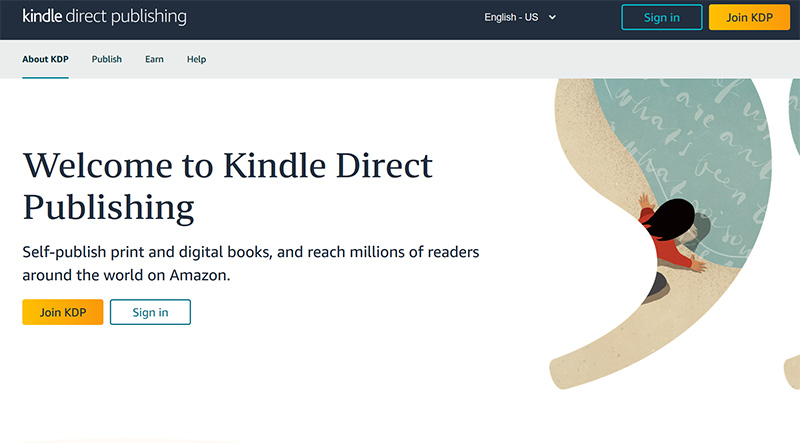
Print or Digital? Will your book be physical, digital, or both? Print books require precise formatting for printers, while digital versions (like eBooks) typically need responsive layouts. Since I plan to publish this book on Amazon, their Kindle Direct Publishing (KDP) has helpful tips on starting the process with them. Learn more about Amazon KDP by clicking here.
-
Page Count: Most illustrated books are 24-32 pages. Decide if your story needs more or fewer pages, based on your narrative and illustrations. One thing to keep in mind is the front matter of the book. This is where you see the Copyright and All Rights Reserved information. What I’ve found useful is to grab another illustrated book and see what type of verbiage they used.
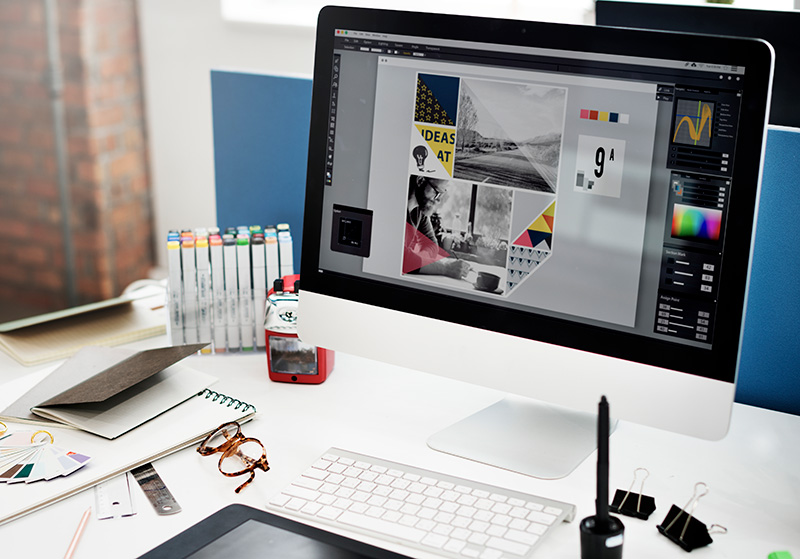
AI can generate illustrations, but you’ll need design software to assemble the final book. Here are some tools to help that I’ve taken from my Quick Guide to Publishing Your Own Children’s Book:
Adobe InDesign
This is what I use for all my books. Part of the Adobe Creative Suite, this desktop publishing software is what I’ve been using for many, many moons. Before InDesign, I was using Quark Express and PageMaker. Today Adobe InDesign is the industry standard for book design, offering precise control over layouts and typography—it’s like Microsoft Word on steroids.
- Pros: Powerful and versatile.
- Cons: Steeper learning curve and has costs associated
- Website: Right now would be the perfect time to maximize savings with their 50% off Creative Cloud for Black Friday (sale ends November 29th) – https://www.adobe.com/products/indesign.html
Canva
A beginner-friendly tool with pre-made templates for books. Great for simple designs and eBooks.
- Pros: Easy to use, accessible for free.
- Cons: Limited for complex projects.
- Website: https://www.canva.com/
Affinity Publisher
A budget-friendly alternative to Adobe InDesign, with similar features.
- Pros: Affordable and professional grade.
- Website: https://affinity.serif.com/en-us/publisher/
Reedsy Book Editor
A free online tool for simple book formatting, ideal for self-publishing.
- Pros: User-friendly and tailored for authors.
- Website: https://reedsy.com
Balancing Text and Images
Your text and illustrations need to work together, not compete. Here’s how to strike the right balance:
- Focus on Readability: Choose a font that complements your book’s tone. For adult-themed books, consider clean, modern fonts or playful serif fonts that reflect the humor. Don’t be afraid to go larger than what we are accustomed to with 10 pt or 12 pt font. Some helpful websites I’ve used to download free fonts are below:
- DaFont: https://www.dafont.com/
- Font Squirrel: https://www.fontsquirrel.com/
- Google Fonts: https://fonts.google.com/
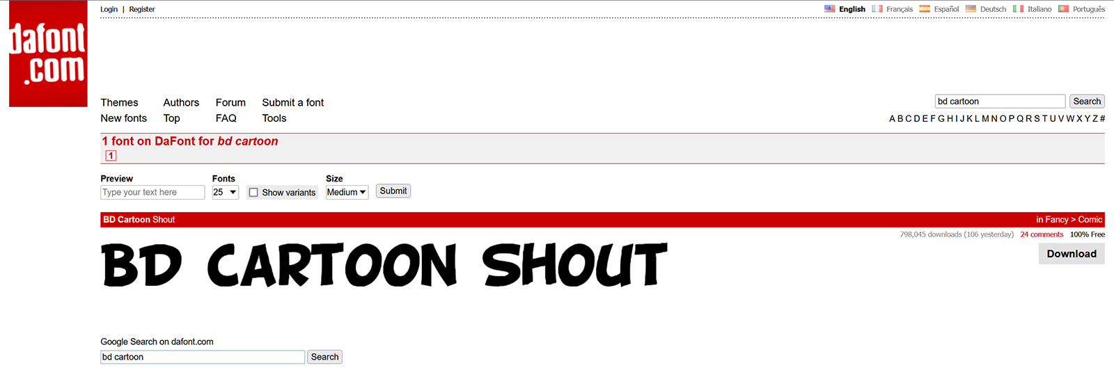
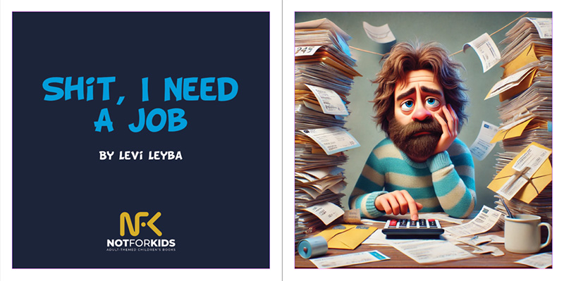
With Sh*t, I Need a Job, I opted to use the ‘BD Cartoon Shout’ font on DaFont’s website found here: https://www.dafont.com/search.php?q=bd+cartoon
- Space the Text Wisely: Keep your text clear of illustrations. Use speech bubbles sparingly to enhance the humor without cluttering the page. You’ll see in Week 2: Bringing Characters to Life with AI-Powered Illustrations, DALL-E was able to add some speech bubbles in a few of the illustrations.
- Consistent Margins: Maintain uniform margins across pages to keep your layout clean and professional. Keep in mind the printer will have some specifications you would need to follow in order to ensure your artwork and text do not get cut off in the final production. To learn more about Margins, check out Amazon KDP’s suggestions by clicking here.
- Background: Not wanting to have a plain white background behind the text, I decided to grab a white sheet of paper and fold it. I then took a photo of it using my cell phone and used that as a background. You can see below how it looks without the image added and then after the image was added.
[insert spreads to show without image and with image]
Example:
In Sh*t, I Need a Job, text placement might look like this:
- Scene: Bob wandering the Jungle of Job Listings.
- Text Placement (Option 1): A humorous caption near the top, with plenty of space for chaotic illustrations below.
- Text Placement (Option 2): Having the wording on one side of the page with the illustration on the opposite side of the page. I’m thinking of going old fashion with this option for Sh*t, I Need a Job.
Speaking of text placement options, the way your pages flow can elevate your narrative. Here’s how to structure your layout for maximum impact.
The Three Key Layout Types:
Single-Page Layouts: Use for standalone illustrations that emphasize key moments or humor.
- Example: Bob’s disastrous encounter with the Interview Monster.
Double-Page Spreads: Great for big, dramatic scenes.
- Example: The chaotic networking event in Sh*t, I Need a Job could span two pages for a more immersive effect. If this is the case, you would need to have AI illustrate horizontally so you can use the artwork across the span of two pages (the spread).
Alternating Layouts: Mix single pages with spreads to keep the design dynamic and engaging. Many illustrated books follow this principle to add some creativity.
To give you some ideas, feel free to visit your local library or bookstore and head to the children’s book section. You will find many different styles on how text placement is used to enhance the story.
Typography is often overlooked but crucial. The right font can set the mood for your book. Here’s what to keep in mind:
- Font Choice: Try to use no more than two fonts—one for the story text and one for titles or captions.
- Size: Make sure the font size is legible (typically 16-20pt for story text in illustrated books). I’ll be using 20pt for Sh*t, I Need a Job.
- Style: Experiment with bold or italic text to emphasize certain words, especially in dialogue or humorous moments.
Once your design is in place, test it:
- Print a Mockup: If you’re creating a print book, print a draft version to check margins, alignment, and readability. Don’t have a printer, save as a high resolution PDF and view on your computer.
- Get Feedback: Share your design with a trusted friend or family member. Are the pages engaging? Does the text flow naturally? Are they saying everything looks good even though you know it looks like sh*t?
- Adjust as Needed: Make tweaks based on feedback to ensure your book is polished and professional.
Some AI tools can help suggest layouts or optimize your design:
- ChatGPT or Claude AI: Ask for layout ideas or advice on balancing text and images.
- ChatGPT: https://openai.com/chatgpt/overview/
- Claude AI: https://claude.ai/
- Canva’s Magic Resize Tool: Quickly adjust designs for different formats.
- Canva Magic Switch: https://www.canva.com/pro/magic-switch/
- Adobe Sensei (AI in InDesign): Automates repetitive tasks, like aligning elements or ensuring consistent spacing.
Now that your illustrations and text are beautifully integrated, you’re ready for the final step in Week 4: Self-Publishing and Marketing. Join me next week for tips on preparing your book for publication (including your ISBN), navigating Amazon KDP, and promoting your masterpiece to the world!


